
.png)
.jpg)
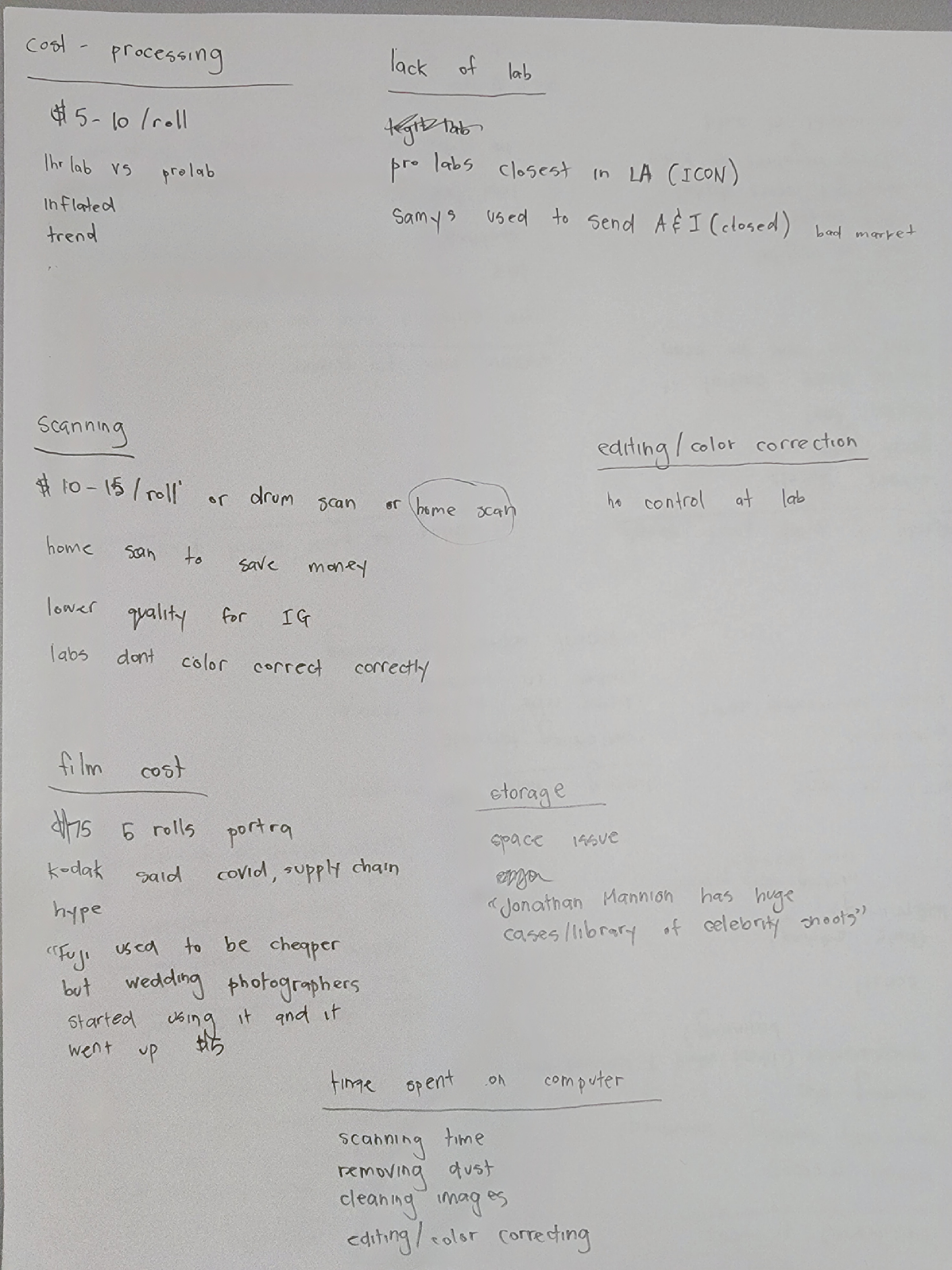
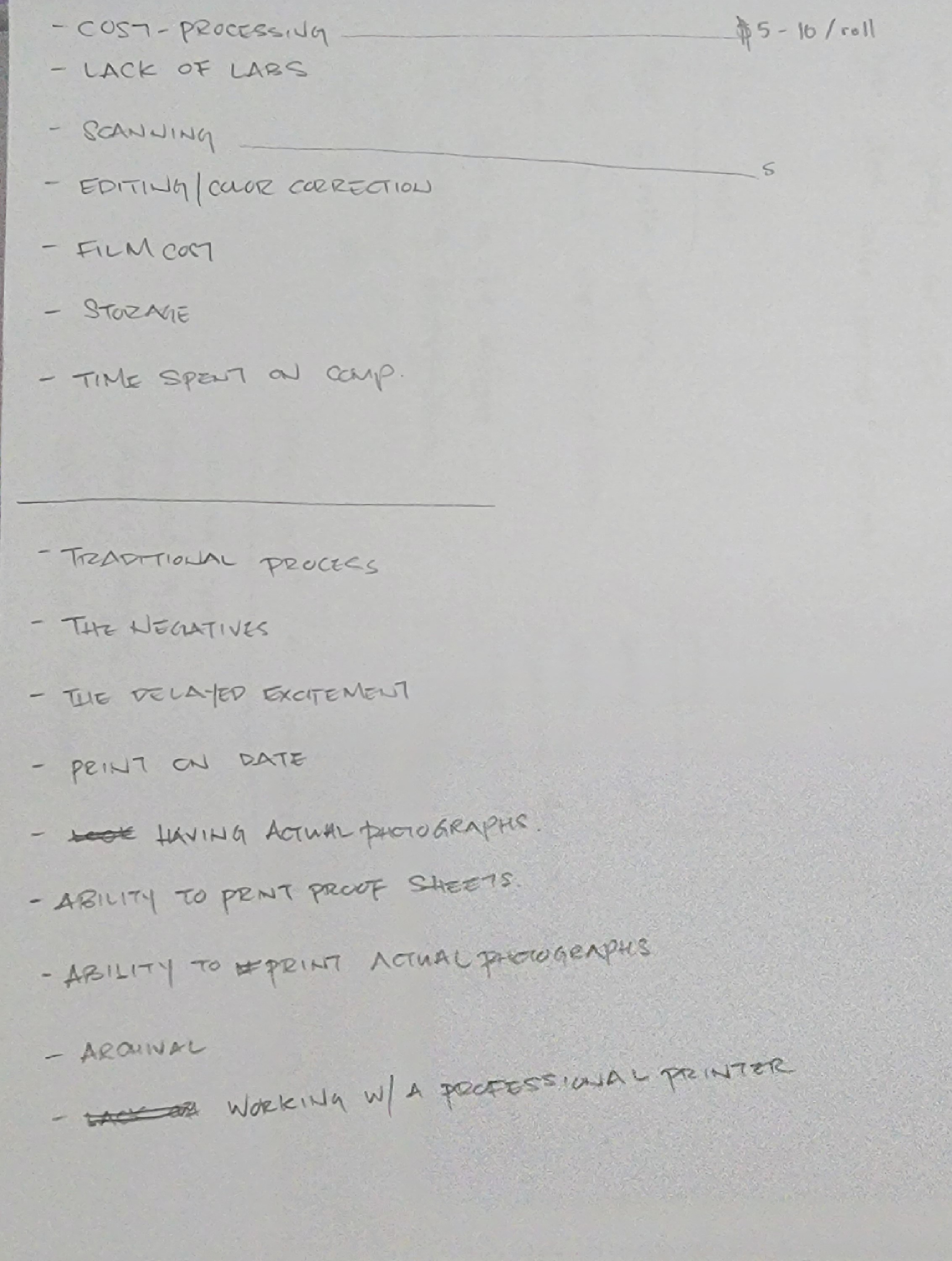
The idea of DARKROOM stemmed from doing user interviews with professional photographers to gather insights on pain points, behaviors, context and perks. Using a 4 List user interview, I asked a professional photographer to write down as many pains and perks that he had with the process of shooting, developing, scanning, editing and printing film. I had the interviewee elaborate on his pains and perks of his process and discovered multiple themes.
Themes
-rising cost
-efficiency/time
-dislike digital editing
-nostalgia
-sharing with others
.png)
After discovering several themes through user interviews, I created user flows in FigJam to help me define a problem to focus on through the flows and insights
I discovered that scanning and editing film negatives had the largest pain points that could be improved upon through creating user flows on FigJam. With the improvements in technology, especially with phone cameras, scanning a film negative to edit on your phone should not take more than 5 minutes or cost a lot!

After gathering all of my research, it was time to develop potential solutions by conducting a design studio and explore components from different apps. I sketched out some ideas on possible features DARKROOM would have with Crazy 6's before comparing them to different components already created in other apps through screenlane.com.
.png)
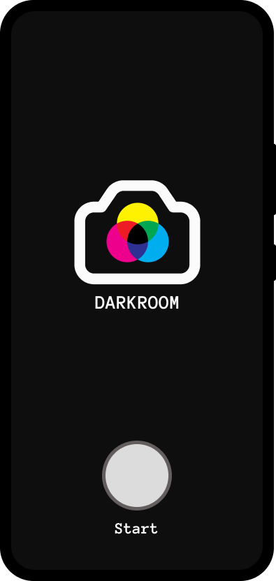
The design studio gave me enough information to increase the fidelity of my designs. I used Auto Layout in Figma to create the components for DARKROOM's digital wireframe and pushed the design to a high fidelity prototype.
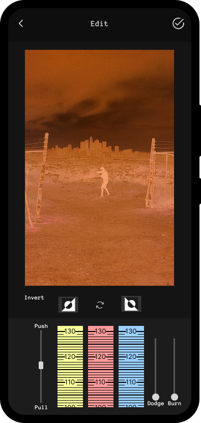
*The latest android phones have cameras over 100 megapixels. enough to take a clear picture of a film negative to edit
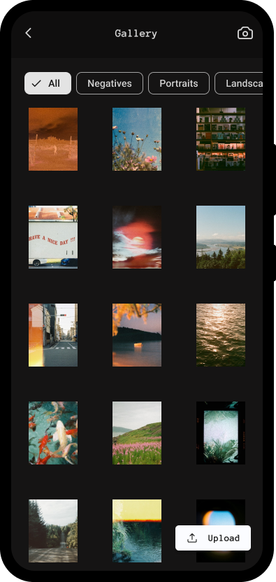
*The dark background makes it similar to a contact sheet
*Clicking the photo will enlarge the image
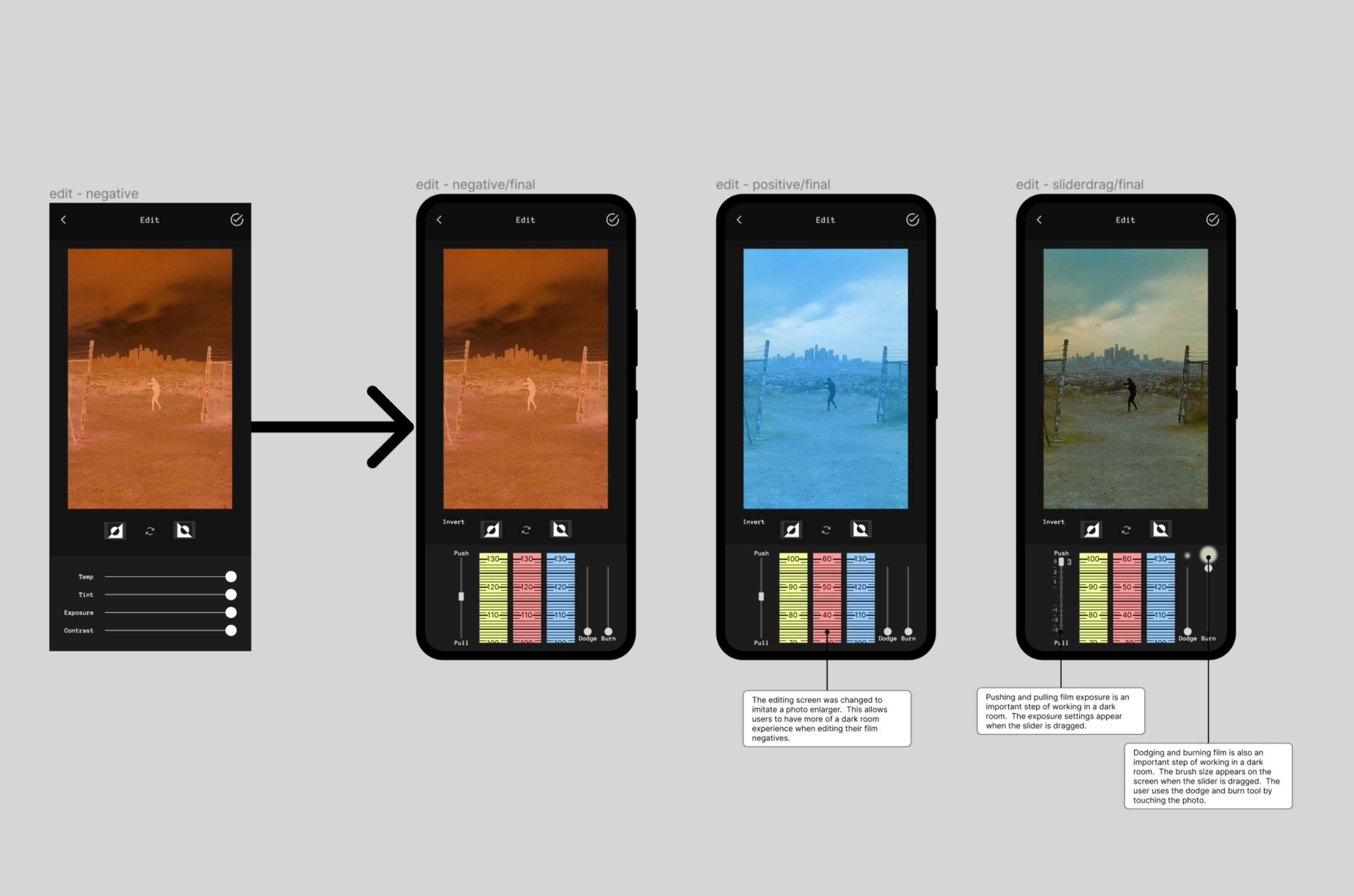
*An important step to converting a film negative to an image is inverting the colors
*Color correcting can be done after the colors of the film negative are inverted by moving the sliders
.png)
.jpg)
It was time to put DARKROOM to the test with a usability study. I used the Hug Method to gather qualititative data forom my usability study.
.png)
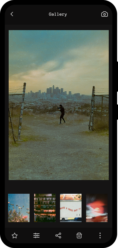
I concluded from the usability studies and user interviews that users wanted to feel like they were working in a dark room. The push/pull, dodge/burn and color adjustment sliders are the main editing tools used in DARKROOM.
I also added a filter tag to the gallery page for better organization. The black background and fixed photo sizes make the gallery look like a photo contact sheet for comparing photos.
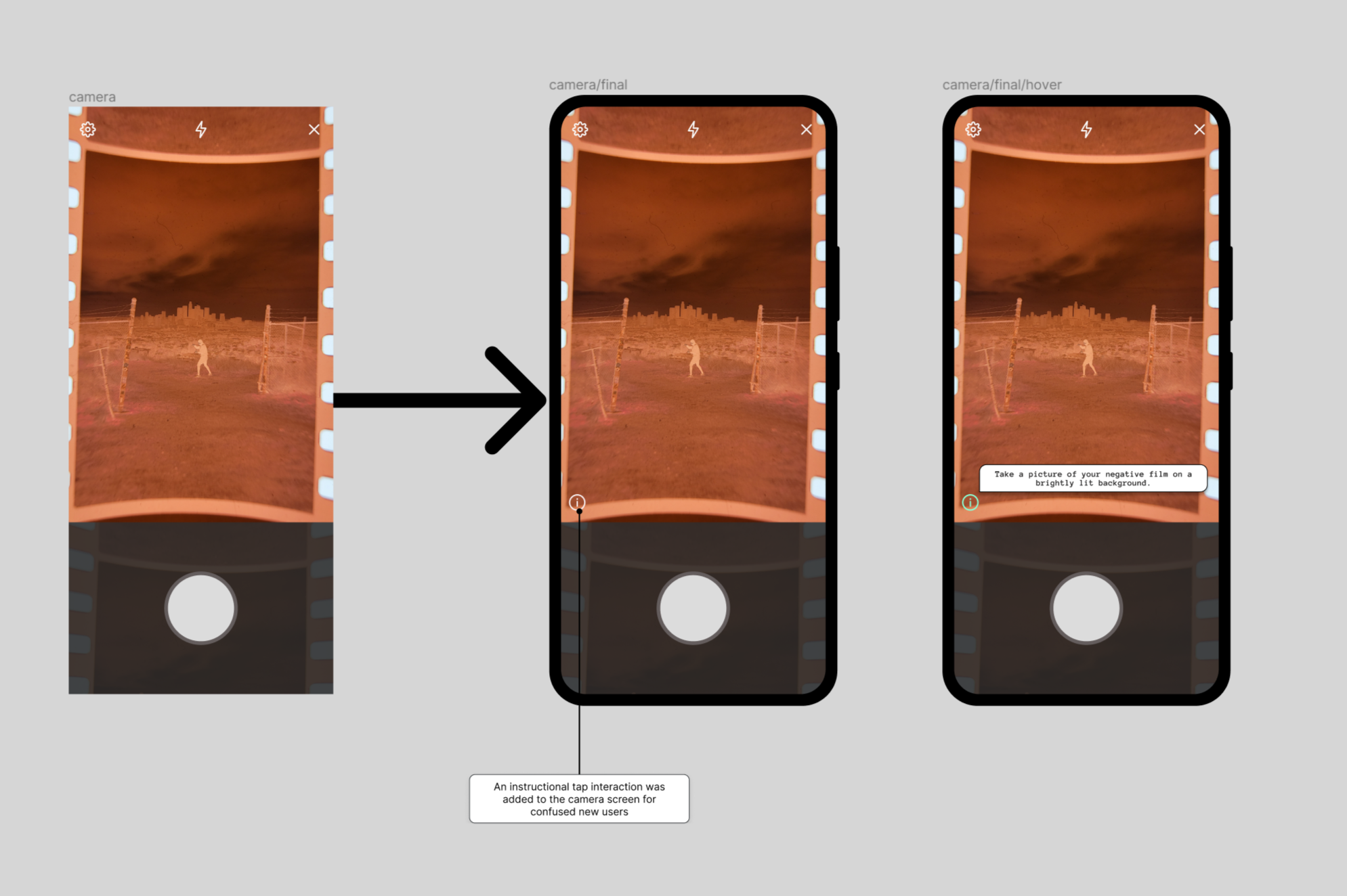
Some users were confused on the instructions when on the camera screen, so an instructional/tip icon was added to the screen to guide first time users.
*The editing screen was changed to imitate a photo enlarger. This allows users to have more of a dark room experience when editing their film negatives.
*Pushing and pulling film exposure is an important step of working in a dark room. The exposure settings appear when the slider is dragged.
*Dodging and burning film is also an important step of working in a dark room. The brush size appears on the screen when the slider is dragged. The user uses the dodge and burn tool by touching the photo.
*A filter tag was added to the gallery screen for better organization and allows users to easily compare photos like a photo contact sheet
*An instructional tap interaction was added to the camera screen for confused new users
I took the time to try and understand the 'Auto Layout' feature in Figma, for this project, and I feel like it really improved the efficiency of my designs. Learning to create components and variants were extremely useful. Designing and prototyping with these new skills would have significantly cut down on the timeline of all of my projects. Adding FigJam to my arsenal also made my userflows more cohesive with the rest of my design process.
But, finding a mentor working in the field was the most beneficial to my progress. It made things more exciting because I had clearer goals on things I needed to learn and improve on.
Thanks for checking out my portfolio project!
-Kevin Chan